M&B - Fashion House:
DECLINE - Record Label:
ZODIAC - Theatre:
Showing posts with label MandB Fashion House. Show all posts
Showing posts with label MandB Fashion House. Show all posts
Sunday, 5 December 2010
Tuesday, 30 November 2010
M&B - Clothes Tags
Development
Just a few shots of the development process for the clothing tags.
I decided to utilise the 3 elements of this brand - the pattern, the pink colour and the foil blocking - and divide up the clothing lines in the same way, each element representing a different range of clothing.
This could then be taken a projected around the entire store. Awesome.
Wednesday, 24 November 2010
Monday, 22 November 2010
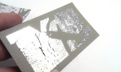
M&B - Foil Blocking
Business card variations
These are some foil blocked variations for the fashion house identity. It's pretty much a toss up between the one with the small logo and the one with the full bleed logo.. Both say completely different things - so it's just a case of picking the one that fits the brief. The small one is understated and quite classy - where as the big one looks bold and almost common. At this stage I'd be tempted to change the biref to fit the one I actually preferred. I'll see about that.
Anyway, the decisions to make here are between the weight of line, the stock and the size of the logo. I've had mixed opinions so far :/
These are all black foil - I think that works best.. but I did try some silver - they didn't work out as well but I quite like the roughness of it all the same.
Thursday, 18 November 2010
M&B - Business Card Development
Above: Much prefer a sans serif for this identity, serif typefaces feel too formal and don't fit with the existing logo and tone of voice.
Above: Going with this layout for the business card and will apply the same formatting to other stationary.
Subscribe to:
Posts (Atom)


