Friday 28 May 2010

Design for Distribution - Evaluation


Though part of a larger module overall, this section of the Design Practice module has been a bit of a roller coaster, as these things usually are for me, however, I'm not sure I like where I have ended up. The Collaborative brief ended quite strangely, and though over all I was happy with the result, I didn't feel I was well prepared for the weeks to follow. This all became evident within the first few days, when as a class we were posed some pretty difficult questions. Everyone had their own way of dealing with them, some were extremely confident - I wasn't one of those.  To have to think in such detail about where I saw myself in industry really terrified me, especially as I knew we were coming to the end of the year - a typically stressful period at the best of times. 

This significantly stunted my progress with the brief at hand, and after a week or so of panic, I began to get to grips with this new idea of writing our own briefs. It took me a long time, too long, to figure out what it was I wanted to get out of this project. The answers were simple really, but again I fell into a trap of trying to predict the outcome of every decision before it is made. This is a massive issue for me. I fear making the wrong decision and so am constantly second guessing myself - I guess this is evident throughout the year. Thinking back to the digital module, the personal issues I was having made it impossible to worry about the work, I just did it and got a great deal out of it - including my best grade yet. So it seems the more opportunity I give myself to worry and over think a project, the more I'll do it.

After this very slow start I finally pinned down what I wanted to achieve. The main one was to get into After Effects as soon as possible and start to really gain an understanding of the software. This in itself confused me as to how I would go about making sure I produced a project that was suitable to submit. I became very aware through the project that I was cutting out huge parts of the development process, lacking a strong concept and generally ignoring everything I'd learnt so far. It soon became a conscious decision - I have proven that I can deliver a project with a solid concept, I can story board and develop ideas in new and interesting ways, and I feel that the goals I had set myself in this module would have greatly suffered had I set out to do the same again. I was also aware that working with motion graphics always takes longer than I anticipate, again reinforcing my decision to limit the amount of actual design development.

Towards the end of this project is where I started to really let myself slip. Lots of the worries from earlier in the project came back, and looking back I can now see that was because I hadn't documented the early stages of the project thoroughly enough, and so the initial decisions I had made - I simply forgot. I also know, and was told many times that I just needed to get on with things, stop thinking and start doing. I think a lot of my failings towards the end of this project can be explained by a simple lack of motivation. The question is then - how can I address this in future? I think the answer to this lies within the briefs I pick in future. As the rest of the course is going to be self directed, I need to really think about the kind of brief I want to answer, I think the most important thing is to make it fun. I need to pick briefs that are fun, or can be made fun, about topics that I personally find interesting and that allow me to progress, rather than stand still. In a sense I'm happy that I had such a hard time with this project, as it's made me realise what I need in a brief, and what I definitely do not need!

To answer the all important question though, the reason I wanted to go down this path of developing technical skills - Do I want to continue with motion graphics? Yes. Definitely. I did not achieve as much as I wanted to with this module, even within After Effects like I wanted to, but it's only left me wanting to do more. I think that's a clear sign that this is what I want to do. Now I just need to make sure that this decision doesn't make me close doors for myself in other areas, motion graphics will be something that evolves and develops with me through my design practice - it's not the be all and end all of everything I do. 

Things to address over summer.
  • Identify the kind of brief that I want to answer in future - keep it fun.
  • Spend time actually being creative with the software I want to develop in - without the stress of a deadline.
  • Do things that remind me why I love what I do, have some fun! 

    • See this as an opportunity to do some of the things I've always wanted to!

  • Get some more contacts within industry, take a few day trips to studios and find out exactly how and where motion graphics fits into the world.
  • Figure out a way to deal with the stress and workload.

    • This is my last opportunity to figure out a way of working that doesn't lead to excess stress and an inability to deal with things - I need to really utilise it.

  • Do not neglect my blog. 

    • I want to do so much over the summer, and I see this as a great opportunity to get into a better blogging routine. Even just 10 minutes every night would solve nearly all of my problems, and help me organise what I need to do the next day. A project diary and daily action plan combined.
To summarise, I have made a bit of a mess of the past few weeks. I think this is to do with my own worrying, making me think instead of act. It's a pretty vicious circle, and I need to be able to recognise when this is happening and take steps to rectify it in future. 

Design for Distribution - Project File

The act of keeping a project file in itself has been massively beneficial in that it has simply made me feel more organised. All those bits of paper that get lost and end up unread are all in one place and in the right order. Definately one to remember.
I feel my over all time management and organisational skills have really improved since easter.


Thursday 27 May 2010

Design for Distribution - Website

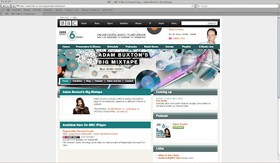
The website is a difficult one to explain - without it being live.
Basically, the website shows who is on air at any time during the day, so the splash page, or home page of the site changes depending on this. Each presenter has there own identity that is in-keeping with Radio 6's current branding, and the individual design is interwoven with what already exists. 

BEFORE


AFTER - Adam Buxton


AFTER - Marc Riley


As you navigate through the website, each presenter's identity is applied to his or hers own page.

ADAM BUXTON
BEFORE

AFTER

MARC RILEY
BEFORE


AFTER


Design for Distribution - Final Videos

So here's the final videos for this submission. I've mixed feelings about them.
On the one hand, I really enjoyed the process of working with stop frame, and rotoscope for that matter. Though both of them look really amateur, I never set out to achieve anything more than that. It was all about the process and the technical ability. I now feel that I can use these techniques to achieve something far more advanced as I have a good knowledge of the foundations of both processes.


On the other hand, I didn't really push the boundaries as far as the overall visuals of the pieces. Pretty standard vector overalys and masks make up the rest of the videos - I slipped back into my comfort zone here I think. As I had used camera moves to make up the basis of the stop frame and rotoscope, I discounted the possibility of another camera in After Effects. I cannot believe I overlooked this opportunity, as working with cameras in the software was an aspect I really enjoyed in the digital module.


I really love how the animated logo turned out. It was the part I spent the most time working with, and I think I achieved a really nice effect. Part of the enjoyment I get from motion graphics is people asking me "How did you do that?" - I got asked that several times with regard to the logo - which is usually a good indicator that I've done something a bit different and interesting.


Anyway, here's the videos. More effort went in than meets the eye, I promise.


FINAL ROTOSCOPE - MARC RILEY


FINAL STOP FRAME - ADAM BUXTON

Wednesday 19 May 2010

Design for Distribution - Rotoscope final illustrations


The final frames for my rotoscope ident. As you can see from the previous post, the block colour just works so much better, it fills the screen more - there's a better black:white ratio. All in all more visually balanced I think. I also like the way the blocks of colour seem to merge together, even without the frame blending - and the inconsistencies between the density of the colour in each frame.

I'd love to have a 24fps version of this, but the process is just so time consuming - far more so than I had imagined. I'm a little behind on my action plan now..

Tuesday 18 May 2010

Design for Distribution - Marc Riley, Rotoscope Finalisation

Much prefer this style of illustration to my previous attempts. The block colour really lends itself to this style of animation as well, I wish I'd realised that at the start though!


The final section of this video - the frame blending by content is almost passable.. If I'd managed to churn out a higher frame rate it would probably have turned out as it should actually look.. without all those weird  squiggly bits (technical term) where After Effects has had to make up what goes between the gaps.


I also purposefully began to leave in the imperfections I found in each image, where as in earlier attempts I edited them all out. The crop marks and finger prints and bits of crap from the scanner have given it a really personalised quality. Reminds me of those situations as a child when you decided you were going to make your mum an awesome birthday card, with all the best intentions, and in the end all you have is a sticky glittery fluffy mess. But still your mum keeps the cards, because the love that went into it is what counts.
If you can sum all that up in a word, you have the tone I'm going for here.
Excellent.

Design for Distribution - Marc Riley, Rotoscope tests

Saturday 15 May 2010

Design for Distribution - Adam Buxton, Initial photos

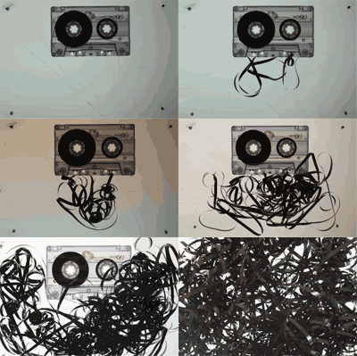
After deciding on the design directions for the 3 chosen radio shows, I started work on Adam's Big Mixtape. These photos are working really well against the light box, I even quite like the scratches in the back ground, adds to that 'hand crafted in my bedroom' feel I'm going for. The lit background gives the whole composition a slightly clinical or technical feel as well.. which I'm not sure on, but I like how it brings out all the inner workings of the tape.


Photobucket

After experimenting with the actual tape inside the cassette, it soon became evident that it was a lot harder to manipulate than I'd hoped.. So the idea of using it as type suddenly becomes unlikely. There are ways round this however, like using sticky tape and pasting the two elements together digitally.
Anyway, I put together this .gif to show how the piece of stop frame might work. I thought about touching up the photos first - but as I said earlier, I really do like the amateur look of the whole thing. It relates back to what a mixtape originally was - something lovingly hand crafted for the recipient, though typically imperfect. Beautiful.

Design for Distribution - Play time in After Effects


Friday 7 May 2010

Design for Distribution - Initial development

Radio vs television - pros and cons?

How the idents can be broken down into a range - 3 of the most popular shows, with the most potential for generating visuals.

Initial storyboards - first design direction

Initial storyboards - potential 3rd design direction?


Still unsure as to whether a 3rd design direction is achievable given how much time I have left. I want to be able to apply each design direction to all of the areas of distribution, so a 3rd design direction would double my work load - yet a range of only two idents seems a little thin on the ground, and gives me less play time in After Effects!

Design for Distribution - Brief REFINED


Tuesday 4 May 2010

Design for Distribution - A face for the radio.

Okay!
Last week was a blip. A pretty massive blip, but it's dealt with and out the way.. Got so wrapped up in all the things I might want to do with my career I forgot how to be a designer. Get a grip Lauren.


The only thing that really matters to me here is getting into After Effects as quickly as possible.


I was talking before about the Climate Cool brief, but in reality it holds very little interest to me, and even if it is easier to generate content this way, it still leaves the problem of things like context and target audience.


So, I figured there's something to be gained from all the areas I've looked at and I re-wrote the brief as follows...


I've decided to base this project on a televised promotional campaign for BBC's Radio 6. There are plans to axe the broadcast in the next year, so I thought it would be quite relevant to incorporate this into the brief - further helping me to define that context that I so desperately need!


I also like the idea of producing a really visual campaign for something that you cannot see. Most the BBC stations have really strong identities as it is, however radio 6 seems to be lacking in anything visual for the listener to associate with. This means I'll not be influenced by what is already there why I start designing. 


This is a lot closer to what I would consider a dream brief, and the process of writing it, along with all the mistakes and confusion has forced me to face a few issues. I'm glad I've got that all out the way now, I have learned a lot about myself the past week or so -  No let's get back to designing!