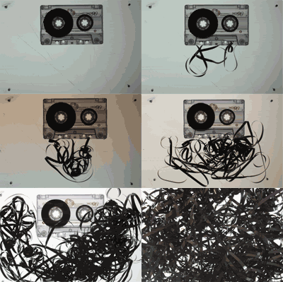
After deciding on the design directions for the 3 chosen radio shows, I started work on Adam's Big Mixtape. These photos are working really well against the light box, I even quite like the scratches in the back ground, adds to that 'hand crafted in my bedroom' feel I'm going for. The lit background gives the whole composition a slightly clinical or technical feel as well.. which I'm not sure on, but I like how it brings out all the inner workings of the tape.
Anyway, I put together this .gif to show how the piece of stop frame might work. I thought about touching up the photos first - but as I said earlier, I really do like the amateur look of the whole thing. It relates back to what a mixtape originally was - something lovingly hand crafted for the recipient, though typically imperfect. Beautiful.


No comments:
Post a Comment