M&B - Fashion House:
DECLINE - Record Label:
ZODIAC - Theatre:
Showing posts with label Decline Record Label. Show all posts
Sunday, 5 December 2010
Wednesday, 1 December 2010
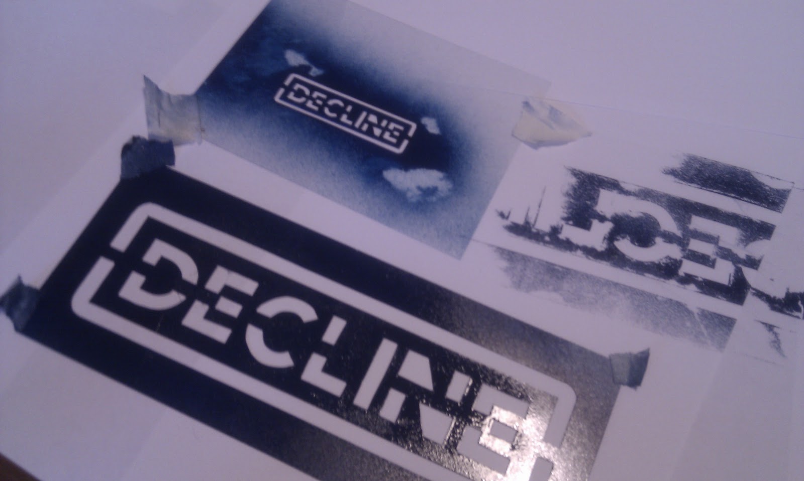
Decline - Stencil
I wanted to give this identity a hand rendered quality, something that the record label could produce themselves, and a method with which they could brand other merchandise or products. I also wanted to produce something reminiscent of the punk zine culture of the 80's/90's.
I tested the stencil on a variety of cheap stocks, again reflective of the cheap handmade zines of previous years.
Monday, 29 November 2010
Thursday, 21 October 2010
3 Identities - Clarification of Audience
So after yesterdays crit I found it is necessary to give a bit of clarification as to the audience/tone of voice of each identity that I'm working on - both for myself and anyone trying to understand what I'm doing!
It's just something that I never got round to formally stating so - here we go.
ZODIAC THEATRE.
Tone of voice
- Sophisticated
- Cultured
- Art Nouveau
- Has heritage / historic
- A little gothic / has an air of mystery
- 30+
- People with an interest in history and heritage
- Cultured
- Intelligent
- Eccentric
DECLINE RECORDS.
Tone of voice
- Aggressive
- Immature
- Hand-rendered
- Viral
- Cheap Production
- 15 - 30 male dominated
- Punk/skate culture
- Reasonably intelligent
- Teenagers with no jobs and no money
M&B FASHION HOUSE.
Tone of voice
- Slightly alternative
- Ready-to-wear (mid range pricing)
- Made to last
- Classic items with a twist
- 18 - 30 females
- Not concerened with changing fashions
- Has own individual style already
- Confident
- Opportunist
Monday, 11 October 2010
Decline - Brand Development
Been a while since I've done anything in Photoshop so this was slow progress, but this is the general effect I was after just needs tidying up a little.
Decline - Brand Development
A different take on the standard stencil font - Not sure it fits the skate/punk feel that I'm aiming towards. Going to spay paint it up a bit and see how that looks.
Decline - Brand Development
Thursday, 7 October 2010
Tuesday, 5 October 2010
Decline - Brand Development
I want to go for a hand drawn approach here. I think hand drawn type can look a bit weak unless it's had a long time spent on development.. A nice short cut is basing the type on a typeface that already exists, or in my case - just picking up the elements that I particularly like.
Got a few synonyms from Thesaurus.com to help speed this logo design up as well - I want something solid for this identity by the end of the day.
Monday, 4 October 2010
5 Identities
Brief 1
The first brief of this module is split 5 ways. I want 5 quick turn around branding exercises - both to build my decision making skills and to kick start the year - it's been a bit slow since we got back.
So, I started by deciding on 5 companies - all within the creative industries and all completely made up. I spent last Friday coming up with names and starting points for all 5 - see below.
GAMES DEVELOPER
FASHION HOUSE
THEATRE
FILM PRODUCTION
RECORD LABEL
The first brief of this module is split 5 ways. I want 5 quick turn around branding exercises - both to build my decision making skills and to kick start the year - it's been a bit slow since we got back.
So, I started by deciding on 5 companies - all within the creative industries and all completely made up. I spent last Friday coming up with names and starting points for all 5 - see below.
GAMES DEVELOPER
FASHION HOUSE
THEATRE
FILM PRODUCTION
RECORD LABEL
Subscribe to:
Posts (Atom)