Monday, 6 December 2010

D&AD -The Bigger Picture

These are all pretty over used techniques these days, but I think they fit the brief really well so I'm happy to at least experiment with them.
The idea being that these will all be printed on a huge scale, so you'll have to literally take a step back to see it what it says.
I'm quite liking the cmyk halftone as a starting point for the rest of the brand as well.


D&AD - Touring Art Gallery


custom type based on the montage of frames you usually see at an art gallery.
I quite like how illegible it is, and how you have to take a step back to see it properly.. quite a nice concept for this brief - going to explore it further.

Sunday, 5 December 2010

Product Shots

M&B - Fashion House:


 DECLINE - Record Label:


 ZODIAC - Theatre:


Saturday, 4 December 2010

D&AD - Touring Art Gallery

As far as I can see there are 3 potential directions or focusses for this brief:
  • Travelling/touring gallery
  • Open to anyone
  • Art appreciation to aid recovery
I've had a go at addressing all 3, but so far quite like the 'bigger picture' approach as it leaves a lot of scope for conceptual branding and marketing techniques - something this brief demands.


Friday, 3 December 2010

Zodiac - Poster Development

Poster variations.

A series of posters promoting 5 productions at Zodiac playhouse.

I knew I had to stick to the conventions laid out in the stationary for this, which was really challenging but a lot of fun actually! It was really refreshing to design a poster in this way, and I think the result is something quite unique. The last picture is the layout I chose for all 5 productions.

It's absolutely essential for me to print type layout tests these days. It just looks so different on screen than it does when printed.. If you wondered why I felt the need to print these!


Wednesday, 1 December 2010

Decline - Stationary

Testing placement of the logo and how the stationary works as a whole.


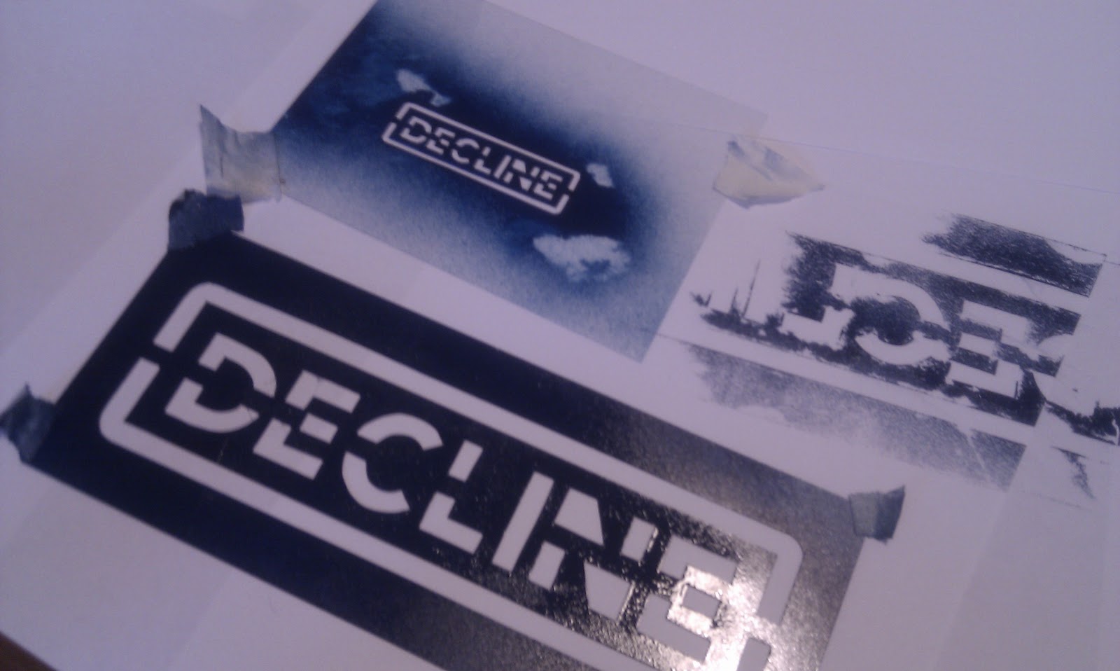
Decline - Stencil

I wanted to give this identity a hand rendered quality, something that the record label could produce themselves, and a method with which they could brand other merchandise or products. I also wanted to produce something reminiscent of the punk zine culture of the 80's/90's.

I tested the stencil on a variety of cheap stocks, again reflective of the cheap handmade zines of previous years.