Layout variations for the theatre's complement slip. I tried to base the layout on the existing business card design, I'm still undecided as to whether this works or not - I do prefer the ones that are altered to accommodate the new format though. I'll put them together tonight and once I see them together I should be able to make a decision, or at least get some feedback.


These two at the bottom are my favourite, very difficult to go from portrait to landscape and not lose the feel of the brand?
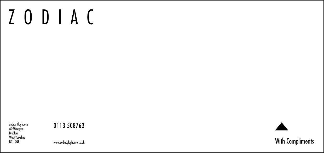
Initially we thought the compliment slip with the arrow pointing to the logo was a nice touch but after a little consideration we feel that the layout becomes a little unbalanced when it's not on the bottom right!
ReplyDelete